Logo Modernism
Jens Müller
Resource Library · RESOURCES
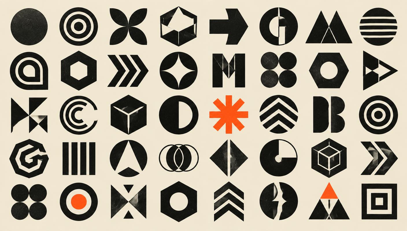
A massive, gorgeous archive of roughly 6,000 marks from 1940 to 1980 — the golden age of geometric corporate identity. Organized by basic form (grid, circle, ring, line, letterform), it is less a book to read than one to wander through with a pencil.
For anyone designing identities, it is the closest thing to a field guide: page after page of solutions to the same problem, showing how much range lives inside the simplest geometric idea. It teaches restraint by sheer accumulation of examples.