Terminology
The words for what you see
Typography · LEARN
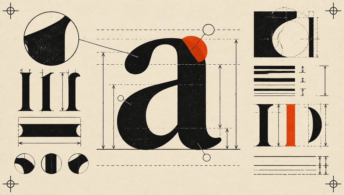
Type has its own anatomy. The baseline is the invisible line letters sit on; the x-height is the height of a lowercase x, and it controls how large a face feels at a given size. Ascenders reach up, descenders drop below, and the counter is the enclosed space inside letters like o and e.
Spacing has its own vocabulary too. Kerning adjusts the space between a specific pair of letters; tracking adjusts spacing across a whole line; leading (pronounced 'ledding') is the distance between lines of text, named after the strips of lead printers once used. Master these terms and you can diagnose any awkward paragraph.
Visual examples
Baseline & x-height
Cap height tops the H; the x-height tops the lowercase
Ascenders & descenders
Strokes that rise above the x-height or drop below the baseline
Counters
The enclosed negative spaces that keep letters open and legible
Kerning
Tightening the gap between one specific pair of letters
Tracking
Even spacing applied across a whole word or line
Ligature
Two letters fused into one glyph to avoid collision