Type Classifications
The major families of letterforms
Typography · LEARN
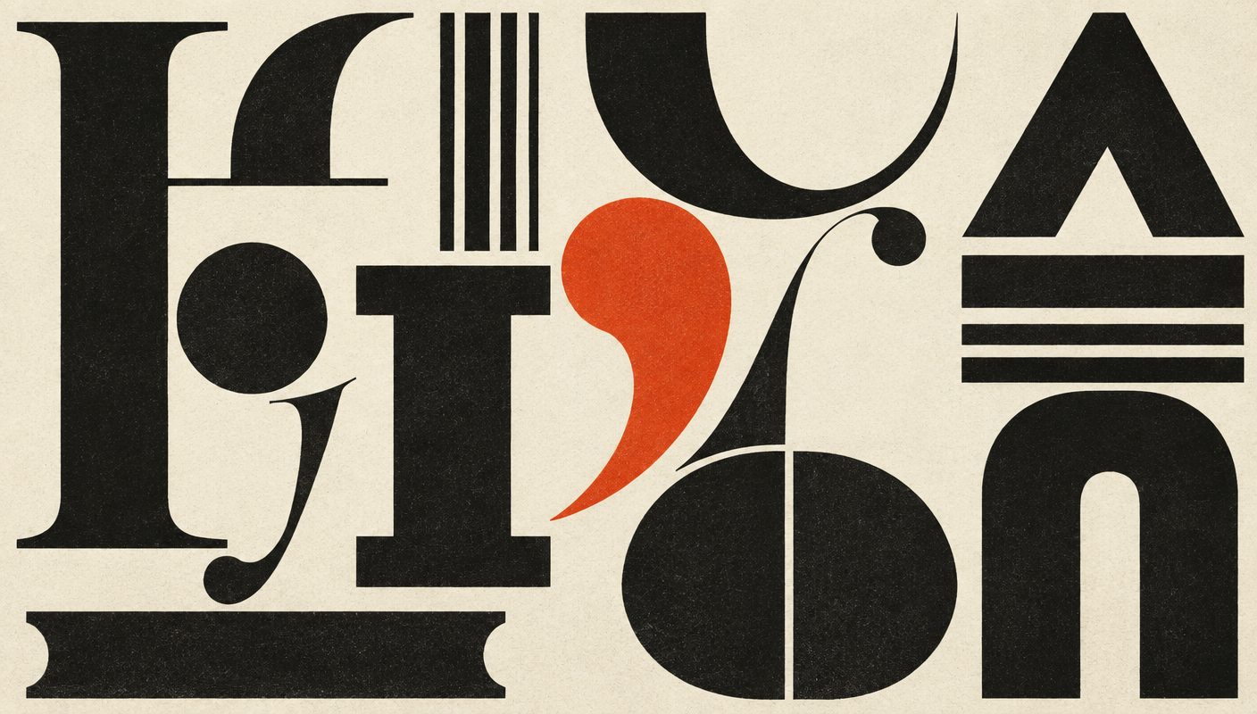
Every typeface belongs to a broad family shaped by the tools and tastes of its era. Serif faces descend from inscribed Roman capitals and the broad-nib pen; sans serifs arrived with industrial advertising in the nineteenth century; slabs, scripts, and monospaced faces each solved a different problem.
Classification is not a strict science — many modern faces borrow from several families at once. But knowing the categories lets you predict how a typeface will feel before you set a single word: a Didone reads as refined and fashion-forward, a grotesque as neutral and direct, a blackletter as historic and ceremonial.
Visual examples
Old Style Serif
Garamond, Caslon — warm, calligraphic, low contrast
Transitional Serif
Baskerville, Times — sharper serifs, more contrast
Didone / Modern
Bodoni, Didot — extreme contrast, hairline serifs
Slab Serif
Rockwell, Clarendon — heavy block serifs, industrial
Grotesque Sans
Helvetica, Akzidenz — neutral, workmanlike, ubiquitous
Geometric Sans
Futura, Gotham — built from circles and straight lines
Humanist Sans
Gill Sans, Frutiger — calligraphic warmth in a sans
Script & Italic
Drawn from handwriting — expressive, personal
Display & Blackletter
Made for impact at large sizes, not for paragraphs
Monospaced
Courier, code faces — every glyph the same width