Design Principles
The working rules
Design Foundations · LEARN
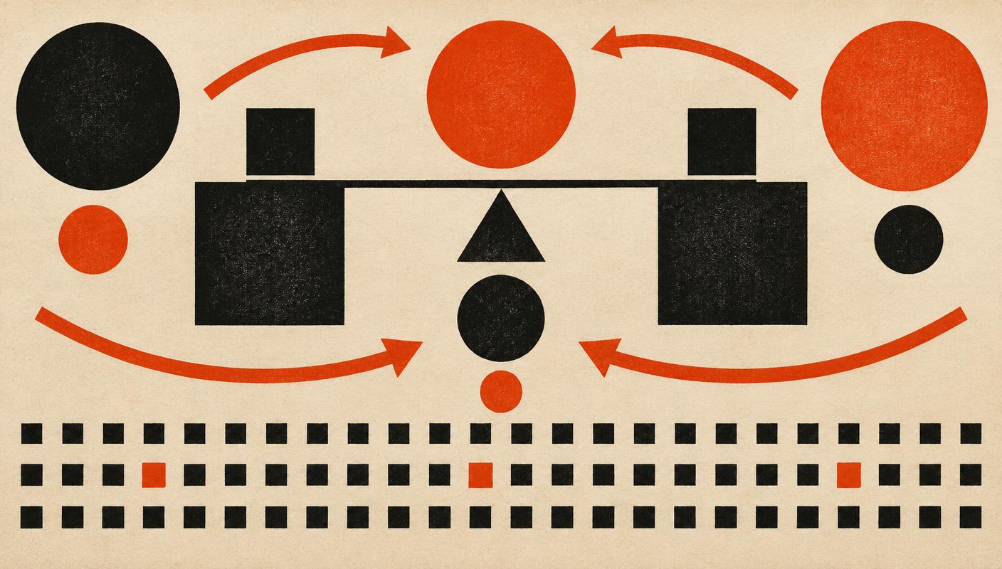
The principles describe how the elements are arranged. Balance is the distribution of visual weight — symmetrical balance feels formal and calm, asymmetrical balance feels dynamic and modern. Contrast is difference: big against small, black against cream, rough against smooth. Without contrast nothing stands out; with too much, everything shouts.
Emphasis decides what the viewer sees first — every composition needs a clear entry point. Movement is the path the eye travels after that, steered by lines, repetition, and placement. Pattern and rhythm come from repeating elements: pattern is the repetition itself, rhythm is the tempo it creates. Unity is the final test — does everything feel like it belongs to the same piece?
Visual examples
Balance
Visual weight distributed — symmetrically or asymmetrically
Contrast
Difference that makes things visible — size, color, weight
Emphasis
A clear focal point — what the viewer sees first
Movement
The path the eye travels through the composition
Pattern
Elements repeated in a regular structure
Rhythm
Repetition with tempo — regular, alternating, flowing
Unity
Everything belonging to the same piece — the final test
 View Design Elements →